Delve
As the design team behind Delve.co, our primary objective was to take a notoriously dry, complex, and anxiety-inducing subject—B2B security compliance—and transform it into a sleek, intuitive, and highly-converting digital experience. We needed to communicate that Delve is not just a standard software, but a cutting-edge AI compliance stack.
Here is exactly what we did to maximize user engagement, drive conversions, and create an eye-catching aesthetic:
1. Designing a Tech-Forward, Premium Aesthetic
To position Delve as a leader in "Agentic AI," we moved away from the boring, sterile white-and-blue layouts typical of legacy compliance software. We introduced a modern, dark-themed visual language utilizing abstract gradient backgrounds blending teal, black, and warm orange hues. This high-contrast approach immediately signals that Delve is a modern, innovative tool. We heavily prioritized clean typography and a meticulous visual hierarchy—much like the highly curated, editorial web experiences seen in premium lifestyle or boutique brands—to make the dense technical information feel approachable and sophisticated.
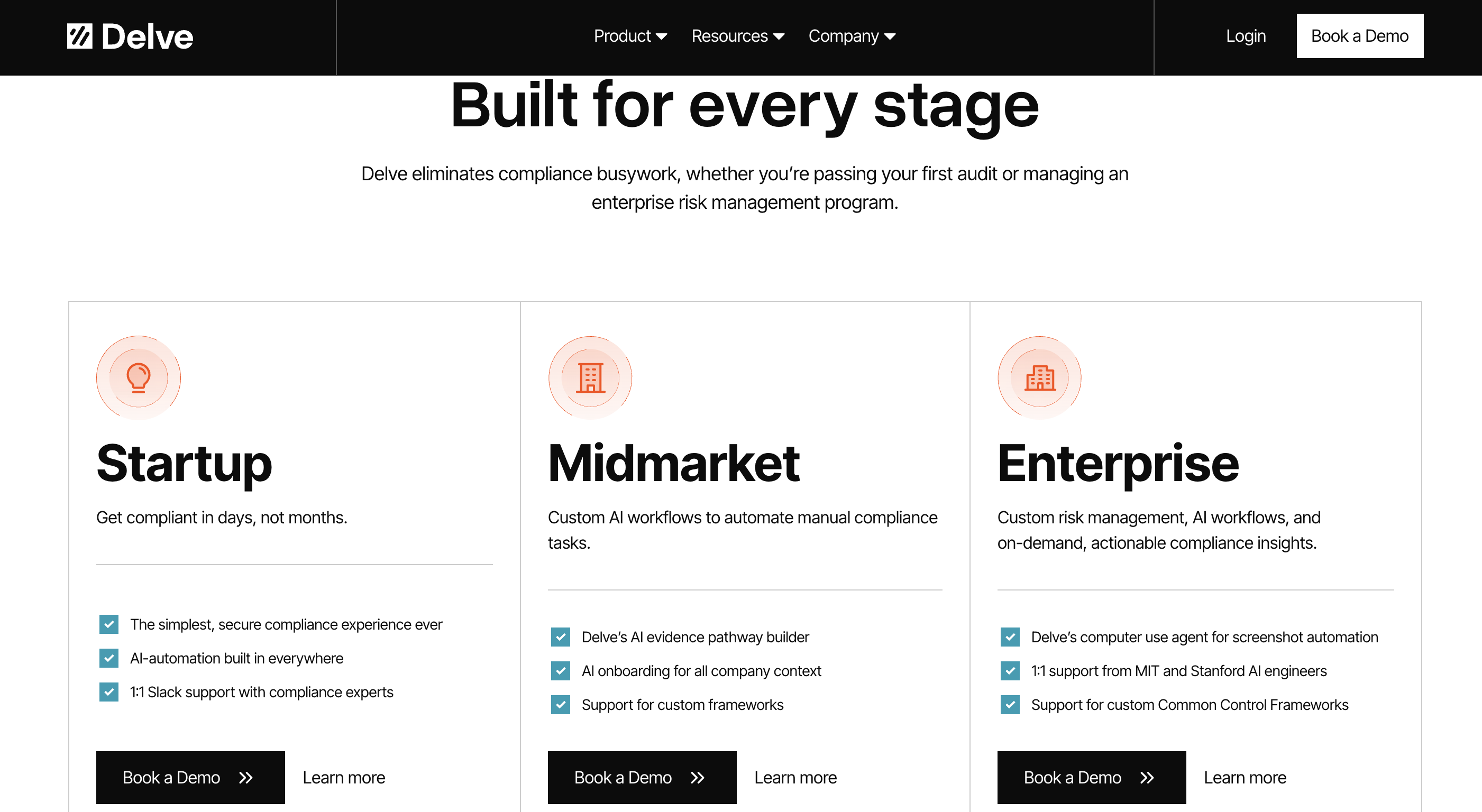
2. Immediate Audience Segmentation
We knew that a startup looking for its first SOC 2 certification has entirely different needs than an enterprise seeking custom risk management. To make navigation frictionless, we structured the architecture directly around the user's scale. By categorizing the journey into "Startup," "Midmarket," and "Enterprise" right in the main navigation, we ensure users can instantly click into a personalized funnel that speaks directly to their specific pain points and budget constraints.
3. Visualizing the Pain Point
Instead of just writing about why compliance is important, we designed visual artifacts that trigger a visceral reaction from founders and sales teams. We featured mockups of lost revenue charts (ARR bookings declining) and a highly recognizable mock email from "Sam Altman" stating: "Cannot Move Forward Due to Lack of Compliance." By visually manifesting the nightmare scenario of losing a massive enterprise deal due to missing SOC 2 or GDPR checkboxes, we created an immediate, emotional urgency to book a demo.
4. Simplifying Complexity with Step-by-Step UI
Compliance frameworks are overwhelming. To mitigate cognitive overload, we designed the "Welcome to the agentic compliance experience" section as a smooth, 5-step interactive flow. This breaks down the process (Pick Frameworks → AI Customization → AI Requirement Completion → Slack Support → Prove Trust) into digestible, bite-sized visual chunks supported by clean UI dashboard mockups.
5. Highlighting Tangible ROI & Social Proof
To build immediate trust, we designed a dedicated metrics section that doesn't just rely on standard testimonials. We brought hard data to the forefront with bold, oversized typography: "43k hours of compliance busywork eliminated" and "$2.3B in new revenue unlocked." Pairing these massive numbers with the banner stating "Trusted by 1,500+ of the fastest-growing companies" creates an undeniable aura of authority.
6. Actionable "Mega-Menu" Navigation
Because B2B buyers often come to the site looking for a very specific certification (e.g., ISO 42001 for AI, or HIPAA for healthcare), we designed the navigation to be an immediate resource. The "Frameworks" dropdown explicitly lists every major standard with a brief, one-sentence tooltip. Users do not have to hunt through blogs to find out if Delve supports PCI-DSS; the answer is readily accessible within one click.
Ultimately, our design strategy was built on removing friction. By combining a premium, modern aesthetic with aggressive problem-visualization and streamlined navigation, we turned the Delve website into a highly optimized sales engine that guides the user effortlessly toward the "Book a Demo" CTA.