Ezra 2.0
Our redesign effectively transitions the site from a basic informational page to a highly optimized sales engine, reducing friction, injecting personalization, establishing medical authority, and mitigating financial risk were some of our strategies for scaling a high converting telehealth brand.
For Ezra’s 2.0 website we collaborated on the following to increase sales and conversions on this site:
1. Immediate Value Proposition & Incentivization
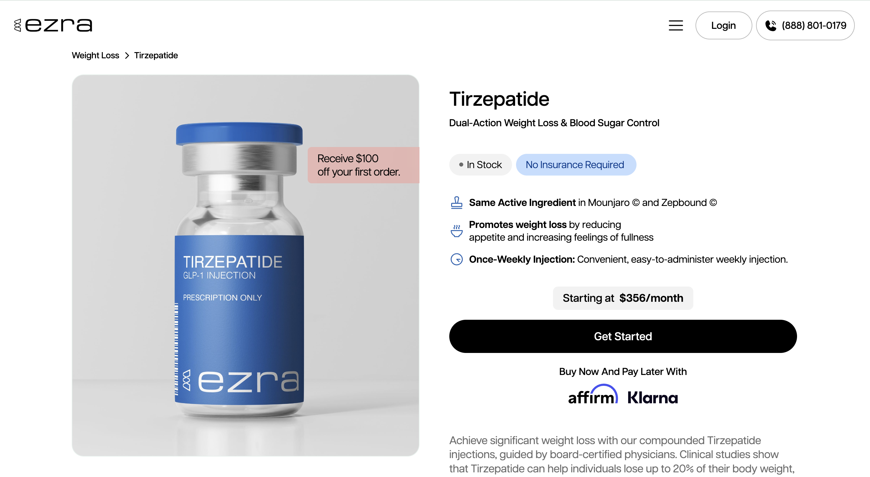
- The $100 Off Offer: Placing "Receive $100 off your first order" prominently at the top immediately hooks the user and incentivizes impulsive sign-ups.
- Clear Value Statements: Above-the-fold bullet points like “Same price at every dose,” “Free expedited delivery,” and “No insurance necessary” immediately address the primary pain points of patients seeking GLP-1s and telehealth services.
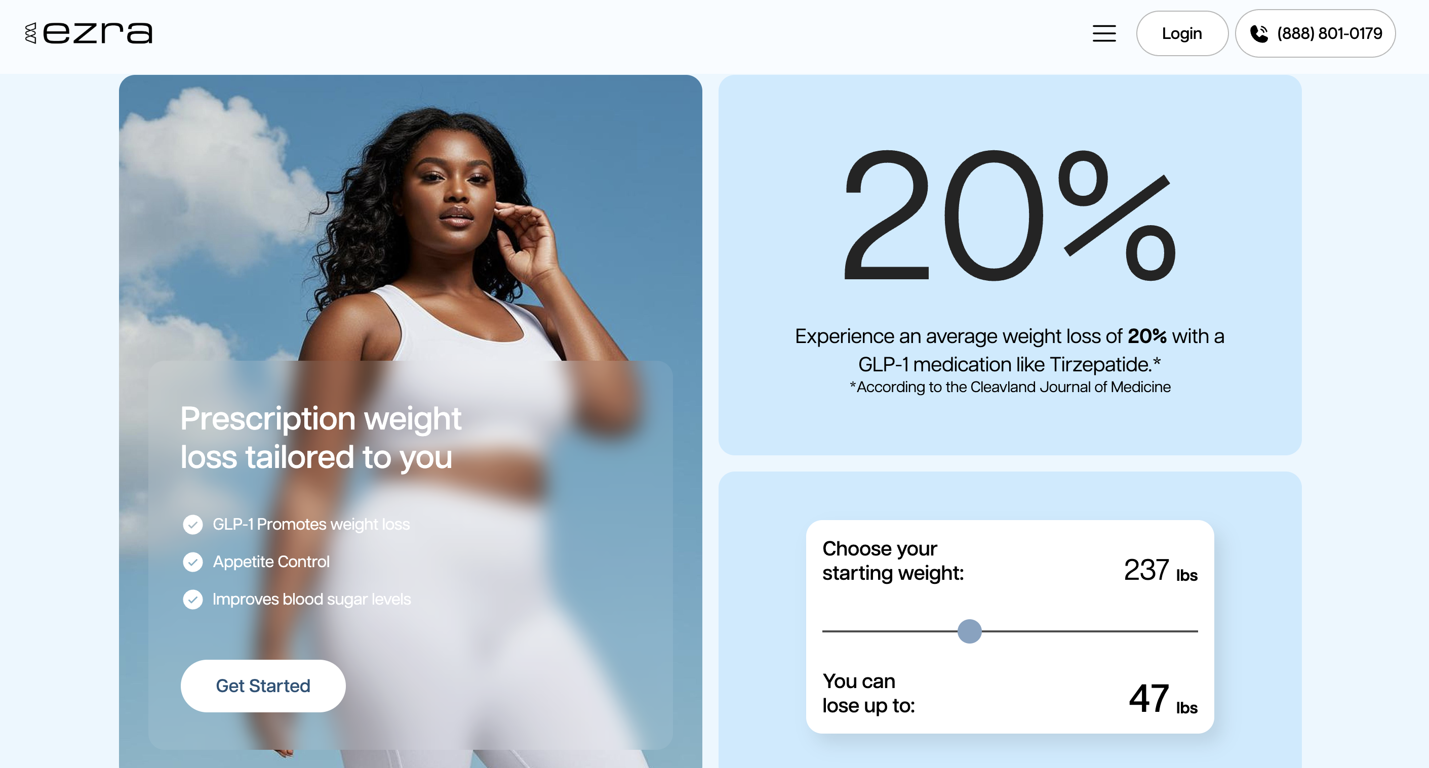
2. Interactive Lead Generation (The Weight Loss Calculator)
- Personalization: You designed an interactive section where users input their starting weight (e.g., "Choose your starting weight: 237 lbs") to see how much they can potentially lose ("You can lose up to: [X] lbs"). This gamifies the experience, personalizes the value proposition, and acts as a powerful psychological trigger to encourage users to submit their information and start the treatment funnel.
3. Frictionless User Journey ("As Easy As 1-2-3")
- Simplifying the Complex: Telehealth can be intimidating. By breaking the process down into three visual, easy-to-understand steps (3-minute questionnaire → Medical provider review → Receive medication in 1-2 days), you reduce cognitive load and buyer hesitation.
4. Strategic Use of Trust Signals & Social Proof
- Authority Building: The "Meet Our Doctors" section puts a human face to the medical process, emphasizing that treatment plans are "Doctor led."
- Customer Testimonials: The "Real Confidence, Real Results" section features relatable quotes and specific weight loss numbers (e.g., "Down 25 pounds," "Lost 18 pounds in three months").
- Compliance & Verification Badges: Placing the LegitScript Approval seal and Trustpilot links in the footer establishes instant credibility, which is absolutely critical for an online pharmacy.
5. Urgency and Scarcity Tactics
- Inventory Badges: Labeling compounded products like Semaglutide as "In Stock" and highly sought-after brand names like Ozempic and Mounjaro as "Limited Stock" leverages the psychological principle of scarcity, pushing users to check out quickly before supplies run out.
6. Tiered Pricing Strategy (Anchoring)
- Decoy/Choice Architecture: By displaying tiered pricing (Best Value at $250/mo, Starter at $320/mo, and Flex at $420/mo), you are using price anchoring. Placing the "Best Value" tier side-by-side with the higher "Flex" tier pushes users toward the 3-month commitment, increasing the Average Order Value (AOV) and customer lifetime value (LTV).
7. Objection Handling via FAQ
- Risk Reversal: In the FAQ section, you proactively answer the biggest conversion blocker: "Will I get charged if I don't qualify for medication?" By clearly stating they won't be charged unless approved, you eliminate the financial risk of filling out the intake form.
- Quality Assurance: You also address medication safety by noting the treatments are sourced from pharmacies compliant with "USP <797> standards," easing fears about compounded medications.
8. Streamlined Navigation & Visual Cues
- Categorization: Dividing treatments into logical, intent-based buckets (Weight Loss, Anti Aging, Peptides, Allergy) helps users find exactly what they want without digging.
- Image-Led Menus: Adding thumbnail images of the vials/medications right in the dropdown menus helps with quick visual recognition and creates a premium eCommerce feel.
- Direct Call-to-Actions (CTAs): Using high-contrast, action-oriented CTAs ("Get Started," "Find My Treatment") linked directly to the go.joinezra.com patient intake portals ensures the funnel is always just one click away.